
Yelp Reservations Case Study

Yelp Reservations billboard at Brannon and 4th St in San Francisco as of July 2017. Photo taken by author.
Yelp recently kicked off a marketing campaign to promote Yelp Reservations in San Francisco with a billboard near the 4th and King Caltrain station and television commercials.
As an avid Yelp user, I wanted to learn how visible this feature was in the application itself. I decided to put the usability of Yelp Reservations under the test with a series of design exercises. (Disclaimer: I am not affiliated with Yelp.)
Empathizing with Users
Usability Testing
I hypothesized that not many people knew about Yelp Reservations and would not successfully reserve a table if prompted to do so. With this assumption laid out, I drafted a script for a brief usability test.
In the spirit of Steve Blank, I “got out of the building” and conducted guerilla user tests with 7 people who could conceivably afford to eat out at restaurants on a regular basis, namely by visiting a food court frequented by professionals in the area.
I screened people by asking:
- How often do you like to eat out each week?
- Do you eat out at restaurants with other people? If so, typically who?
- How often do you cook at home each week?

User engaging with Yelp app during a guerilla usability test.
From there, I asked them to imagine booking a table for the friends or family members they typically eat with for a special occasion coming up.
With Yelp open to view what’s available nearby, each person navigated the app.
Test Results
Of the 7 people tested, 2 were screened out because they prefer to cook at home or stick to their favorite spots where they would call the restaurant directly.
The remaining 5 were able to book a restaurant through Yelp.
Collected Insights
We recorded videos of each usability test and afterwards, I followed a process of Structured Empathy Mapping by taking notes on post-its of what the users SAY, THINK, FEEL, and DO in each video.
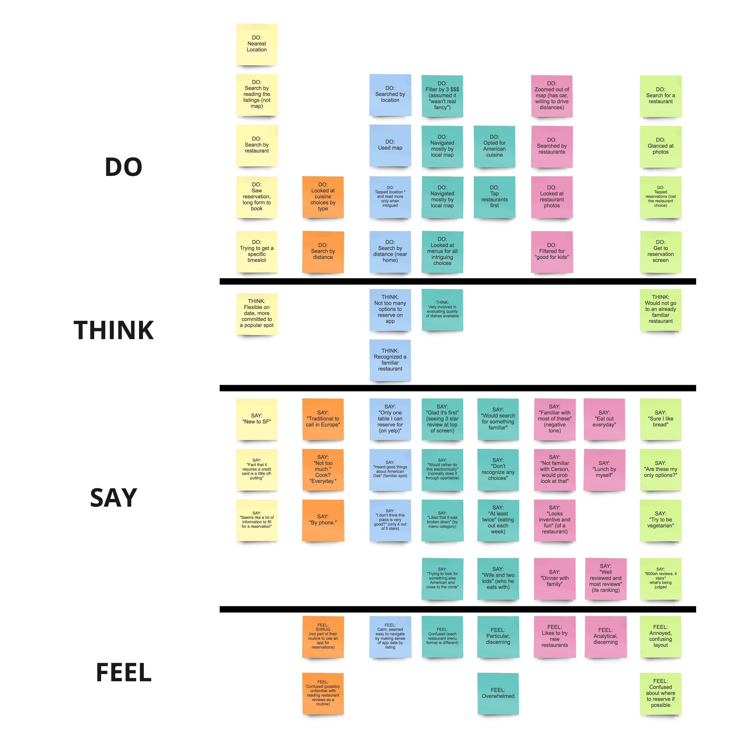
Structured Empathy Mapping. Each color represents a unique user and rows are organized by SAY, THINK, FEEL, AND DO.
The majority of the observations that were both important to the business and important to the user were successfully covered by the existing user flow, including search results by restaurant listing and search results by map, flagship features of Yelp.
I wanted to scratch beneath the surface of this successful test to identify design opportunities.
Defining the Problem
Proto-Personas


With the usability testing research before me, I created proto-personas in order to better understand who Yelp serves and the different goals each persona had.
If I were at Yelp, I would take these personas and work with client services and business intelligence folks to validate these personas, but as is, the proto-personas are similar to the testers who interacted with the app.
The biggest design opportunity came from Barbara and Rajiv, customers who regularly used Yelp for personal life or professional life.
User, Situation, Motivation, Outcome
With these personas, I'm able to better identify job stories using the User Situation Motivation Outcome (USMO) format so that I can brainstorm specific design opportunities in an already-successful product.

I've highlighted the job story for Barbara in orange as a potential design direction, but I want more substantive evidence that this direction makes sense.
The usability results showed that these personas were able to successfully complete the task while accounting for their unique needs. If I were at Yelp, I would be proud. However, I still had not quite articulated what was not addressed in this research so far.
Ideating Solutions
Task Flows
After the USMO, I created a task flow that represented the thought processes I observed in the testers. Perhaps there were some design opportunities that can be uncovered through there.

Task flow for booking a table through the Yelp mobile app.
In the task flow above, the magenta rectangles identify the biggest moments of friction a user encountered during the reservation process:
- Not liking the nearby selection of restaurants
- Not being able to get a table for the desired timeslot
- Having to call to book a table
One major assumption about the task flow is that the user knows they need to make a reservation. What about a Yelp experience in which a user looks up a popular restaurant on Yelp, goes to the location and finds out that they should've booked a table in advance? In this situation, the Yelp user does NOT know that they need to make a reservation and Yelp's greatest asset, its user-generated restaurant reviews, is turned into a poor user experience.
Thinking more broadly than the core use case of users actively seeking to make reservations, I decided to improve the experience of encouraging users to book reservations at popular restaurants they intend to go to when they don't yet know that reservations are advised.
Prototyping Solutions

Paper Prototype
Through a paper prototype, I identified existing elements that could be emphasized in a slight redesign, such as making the reservations Call-to-Action a sticky feature at the footer and adding a bubble to call out the number of reviews that mention reservations.
Before and After
Using the Yelp Design System, I pulled existing design patterns to optimize for restaurants not yet onboarded to the Yelp reservation system. With a product team actively working on business metrics for restaurants already booking tables through their technology, I decided to focus on restaurant pages that users cannot book tables in the app for yet.

BEFORE:
In the recommended reviews area, a number of reviews mention the word "Reservations", but the user is left on their own to leave it to chance if they can find a table.

AFTER:
I added a sticky footer that called on the user to call the restaurant for reservations, with a blue outline to indicate the number of Yelp reviews that mention the word "Reservations", as well as a note to book a table with a fire icon.
Testing with Users
To be continued!